


情境
代码:
<!DOCTYPE html>
<html lang="en">
<head>
<meta charset="UTF-8">
<meta name="viewport" content="width=device-width, initial-scale=1.0">
<title>Document</title>
<style>
.container {
width: 80%; // 此处元素宽度不可改变
height: 300px;
border: 3px solid #aaa;
position: relative;
margin: 0 auto;
}
.item {
width: 100px;
height: 100px;
border-radius: 50%;
background-color: #f40;
left: 0;
top: 30px;
position: absolute;
animation: move 4s linear infinite;
}
@keyframes move {
50% {
transform: translateX(300px); // 希望此处的 300px 能根据父元素宽度自动获取
}
}
</style>
</head>
<body>
<div class="container">
<div class="item"></div>
</div>
</body>
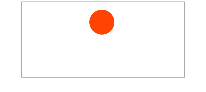
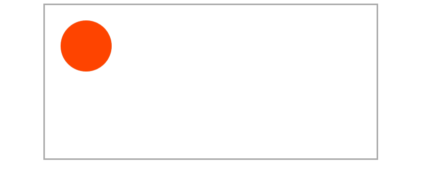
</html>示例中一个元素通过 transform 动画移动,单纯靠 css 无法获取到父元素的宽度(父元素宽度固定 80%,不可更改),导致不能按照父元素的宽度来移动
解决办法
1. 纯靠 js 实现动画效果,但是这种方法的效率不高,不考虑
2. 通过 js 获取父元素的宽度赋值给 css 变量,动画效果依旧由 css 实现
定义一个变量 --w,原本的 300px 修改为 calc(--w) - 100%,那么我们只需要想办法把父元素的宽度赋值给 --w 就可以了
@keyframes move {
	50% {
    	transform: translateX(calc(--w) - 100%);
    }
}
获取父元素的宽度并赋值给css 变量可以这么玩儿:
const container = document.querySelector('.container');

const item = document.querySelector('.item');

item.style.setProperty('--w', container.offsetWidth + "px");
这样问题就解决了
全部代码
<!DOCTYPE html>
<html lang="en">
<head>
    <meta charset="UTF-8">
    <meta name="viewport" content="width=device-width, initial-scale=1.0">
    <title>Document</title>
    <style>
        .container {
            width: 80%;
            height: 300px;
            border: 3px solid #aaa;
            position: relative;
            margin: 0 auto;
        }

        .item {
            width: 100px;
            height: 100px;
            border-radius: 50%;
            background-color: #f40;
            left: 0;
            top: 30px;
            position: absolute;
            animation: move 4s linear infinite;
        }
        @keyframes move {
            50% {
                transform: translateX(calc(var(--w) - 100%));
            }
        }
    </style>
</head>
<body>
    <div class="container">
        <div class="item"></div>
    </div>
    <script>
        const container = document.querySelector('.container');
        const item = document.querySelector('.item');
        item.style.setProperty('--w', container.offsetWidth + "px");
    </script>
</body>
</html>
评论区